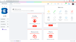
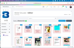
I decided to check over my preferred platform for online education using the POUR filter today. The POUR filter, for those not in the know, is an acronym used to determine accessibility for exceptional users who may struggle with more conventional GUI interactions. Please note that the images in this post are thumbnails which open in new tabs;Iwill endevaour that all future images also be links to facilitate access by users with visual exceptionalities.
The POUR filter stands for Perceivable, Operable, Understandable, and Robust, and can be applied to any site. I used bettereducate.com, a teacher-vetted repository for resources available across BC.
In critiquing the site, I used a number of techniques recommended by Glenda Watson Hyatt, an advocate and online accessibility expert who works primarily as a consultant for various government organizations. One of Glenda’s recommendations is to surf the site with your non-dominant hand. This highlights tightness of format, clashing menu access, and button location, and I found bettereducate.com to be quite user-friendly in terms of the formatting and layout of menus. Full disclosure, as a long-time guitarist, I have a great deal more facility with my left hand than the average person, so that may play into my quick navigation of the site.
Another suggestion is to attempt to navigate the site using only the keyboard. The ‘Tab’ key allowed me to move through the site quickly, and select menus with the enter/return button. However, some potential barriers include the difficulty in recognizing highlighted links; the change in the thumbnail graphic was pretty minimal when selected. Additionally, there are any number of different menu options presented on the main page, and took a great deal of time to navigate down to lower buttons located near the bottom of the page, In all, inconvenient, but still navigable.
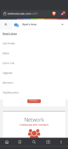
I opened the site using a few common browsers, and also on mobile devices running both Android and Apple iOS. The site was optimized for desktop use, and there was little to no change between desktop operating systems, and browsers (Brave, Safari, Explorer, and Chrome). The site text on mobile was significantly smaller,
which stands to reason given screen size, but this still made it difficult to read and access links in default formatting on the mobile devices, and required a switch to landscape mode which might be potentially problematic.
I found the actual hosting of the site to be funded through larger established entities, through the BCPVPA, as well as (surprisingly) Baseball Canada. Owing to the size, nature, and longevity of these hosts, the site appears to be well ensconced in the net for the foreseeable future.
For more information on website accessibility auditing, or to see the sources used in this article, please visit Ms. Watson Hyatt’s site at http://blogaccessibility.com/ .


Leave a Reply
You must be logged in to post a comment.