
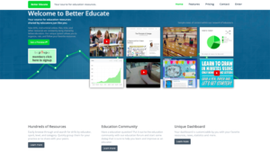
Bettereducate with pronatopia filter applied.
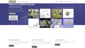
I often link students and colleagues to content on www.bettereducate.com, as it provides me with free hosting for resources or resource compilations. I installed the ‘NoCoffee’ extension in my Chrome browser, and reviewed the site through the lens of a visually challenged person. With the pronatopia filter on, I noticed that red and grey become more difficult to differentiate between, which rendered some links to almost invisible. Regardless of the visual filters, the grey text on white background barely provides enough contrast for easy visibility. If any aspect of ‘colour-blindness’ is couple with visual issues, the homepage becomes almost unreadable, due to small text and lack of strong contrast or spacing between content. In fact, as with colour deficiency issues, any deviation in visual perception renders the on-screen text inaccessible.
Interestingly, despite resetting the visual impairment menu, the browser extension continued to mess with the display on Chrome, and so I ‘lived’ with the screen flutter for the duration of my examination, until refreshing the page.
 A big step towards accessibility for bettereducate.com would be to improve the level of contrast between text and background on the homepage. Light grey text on white becomes practically illegible with even the slightest visual impairment, and is a colour palette that absorbs the red icons integrated into the content throughout the page.
Additionally, the homepage requires some resizing of content, and more spacing so that images or thumbnails are not stacked on top of each other, or bleed together visually. It should be noted that the user section is much better laid out, and less prone to visual interference.
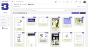
Internal content with colour interference applied
Paul Chong
Hi Ryan,
It seemed like you definitely spent more time on the colour filters which I did not do too much. I ended up only trying a few and it seemed my resource was generally able to “work around” the filters. Perhaps it had to do with the content. Did you try the more evasive filters? It seemed that most of our class deemed it super difficult to navigate the content with such restrictions. Great post!
Ryan MacGregor
Truthfully, I found the major visual components to be incredibly hampering. Just more evidence that visual based components are not enough, and how crucial it is to supply access for varying abilities. My wife and I ended up in an interesting discussion in regards to Ann’s piece, somewhere along the lines of whom websites are written for, as far as a desired audience. In Ann’s case, she was looking at it in terms of nursing, and the question was raised as to whethersomeone was capable of executing certain duties while visually impaired, for example giving medications or administering hypodermics.