
The digestive system is part of the BC curriculum for grade 6 science. As I am always looking for a great way to engage students, I thought I would approach the big ideas that would allow a child to minimally meet expectations when assessed. While this distillation is by no means a replacement for the curriculum or my teaching, “when you have an opportunity to display information visually, take it” (Balliett, 2011).
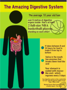
When I sketched out my infographic, the visuals came together in a global sense, but seemed a bit disconnected, like random factoids. Dunlap and Lowenthal (2016) provided a schema that I applied to create user engagement, consisting of the situational qualities of immediacy, malleability, compellingness, resonance, and coherence. In tailoring the hook to the target audience, a sense of immediacy is created as most of the learners receiving this are in that 9 to 12-year age range. By “asking learners questions that encourage reflection” (Dunlap & Lowenthal, p. 47) or by giving statements that are immediately relatable, the viewers start interacting on first glance. This malleability relates viewers to the information, as in “I have that”, “I had that”, or “I will have that”. The use of pop-culture graphics (the basketball) and highlighted text is aimed at drawing in those who may not be as interested in science, but are interested in professional sports.
Compellingness is a thread that runs throughout the generated infographic, as the basketball graphic “evokes learners’ interest, attention….and sharing… the unexpected… to make a message memorable and sticky” (Dunlap & Lowenthal, p. 48), as was referencing waterslides, snot, and poop. Even the colloquial use of the words is designed to draw attention, both with their relation to scientific terminology, and with the aspect of cheekiness…all while adhering to the initial learning outcome of functions and structures of the digestive system. This dovetails with resonance, which is in essence the connection made between viewer and product (Dunlap & Lowenthal), which were determining factors in the information points selected for the poster.
Structurally, the principles imparted by Balliett (2011) were employed systematically. The initial colour palette was adjusted as the effort was made to “avoid white as a background” (Balliett, n.p). Though the resulting product was a deviation from the suggested ‘rule of three’, the colours present were non-negotiable as being part of the template available from www.easel.ly. Generally, there are three dominant colours that contribute the bulk of the palette, and that were different enough to not be an issue when viewed by someone impacted by colour deficiencies (as tested by utilizing the NoCoffee vision simulator in a browser window).
An effort was made to generate a ‘hook’ that was both centred, and dominated the reading path; as information moves down the page (the ‘flow’, as noted in Vogelsinger (2014)), it decreases in size, drawing the eye down. The lighter colours were selected, as recommended, as the background (this was by default, but nonetheless the template was employed because of their default position). Finally, the story process of ‘idea to data to conclusion’ (Balliett) was considered, as the information contained on the infographic deliberately mimics the passage of food through the digestive system, from mouth, to stomach, to colon and waste products. The last fact was hidden at the bottom to both tickle the learner’s sense of humour, and so as not to detract from the overall content because of the nature of the information.
References
Balliett, A. (2011, October 14). The do’s and don’ts of infographic design. Retrieved February 15, 2021, from https://www.smashingmagazine.com/2011/10/the-dos-and-donts-of-infographic-design/
Dunlap, J. & Lowenthal P. (2016). Getting graphic about infographics: design lessons learned from popular infographics, Journal of Visual Literacy, 35:1, 42-59, DOI: 10.1080/1051144X.2016.1205832
Vogelsinger, B. (2014, July 16). Inventing infographics: Visual literacy meets written content. Retrieved February 16, 2021, from https://www.edutopia.org/blog/infographics-visual-literacy-written-content-brett-vogelsinger
Junxiang
Hi Ryan,
I enjoy the analogy you used to explain the digestive organs and the fun fact at the bottom of the infographic. You have precisely followed the theoretical instruction for an effective infographic design. It’s an informative post to read. Regarding the infographic, I would suggest using fewer numbers of colour. But as you mentioned, we indeed have less control when using a template, which is also one of the traps of using templates. Thanks for your post!
Grace Landreville
Hi Ryan,
Great infographic! Your design is captivating without overwhelming with irrelevant information. It reflects well the theories we have learned in class. I like the hook using the language of your audience and how the informative draws the eye to the bottom as it was following the path of the digestive tract. A thought, the font size is quite small at the bottom, would different levels of subheader be a better fit to draw the attention down?
Thank you for sharing!
Ryan MacGregor
Hi Grace, Thanks for your feedback.
This poster is designed to be a 34 by 22 inch poster, so I guess it WOULD look small in the sample here… Ah, the joys of digital representation!
Grace Landreville
Ah yes, the joys of digital representation! Still a great infographic.
Paul Chong
Hi Ryan,
I really liked your approach to make it interesting and appealing to your young learners. Connecting science with real life and also things that they may relate to really do help keep them engaged. And you never know, they may remember these interesting facts for the rest of their lives! I didn’t have a chance to see the pre-made templates and how much control you have. The placement of the basketball did interfere with the text a bit and also the sentence regarding the saliva makes me think my saliva can break down acid! Is that just me? Perhaps “Saliva in the mouth has enzymes that act like acid to break down food” makes more sense to me. I had to do a triple read to figure out what was meant =). Also are we talking about two Steve Nashes or maybe two Yao Mings? =P
Ryan MacGregor
Thanks for the feedback, Paul… I can see how that one fact might be misconstrued, and would benefit from rephrasing. Did you find the basketball interfered with the text when it was at full size? Or just when it was thumbnailed?
Cheers!
Paul Chong
Hey Ryan,
It slightly difficult to read in both full and thumbnail version. This is just my opinion though. Still, a great infographic!
Ann Capulong
Hi Ryan,
Your infographic is great for what you are trying to achieve! I like the juxtaposition of the solid human body, the digestive system, and the background colors. It adds that pop of interest.
I found the format easy to read and straight to the point; and you add a few fun elements (basketball players, snot, wombat feces) that draw the attention of your target audience.
Initially, the basketball and square graphics seemed a bit distracting, but if you intend to make this into a poster, I can’t fault you for that! I also realize one needs to take into account how the image/text translates onscreen.
Ann
Keith Webster
Hi Ryan, I think this is a good example of an infographic relating a few key facts on a topic. I agree that the ‘hook’ to bring in learners not ‘intrinsically interested’ in the digestive system works.
With more space you might be able to draw a digestive system across a portion of a basketball court (though that might be a graphic too far for some learners). You could also consider a cutaway projected to an enlarged version showing the surface of the intestine as described in the graphic.