Month: February 2021

Designing a Student Media Project Outline

Examining and constructing learning outcome for a French biography project.

By completion of this assignment, students, in accordance with BC curriculum, will be able to show use of common, high-frequency vocabulary and sentence structures for communicating meaning by showing they can:

  • ask a variety of questions
  • give descriptions of others
  • express likes, dislikes, and preferences

L’Ami(e)- Une Biographie

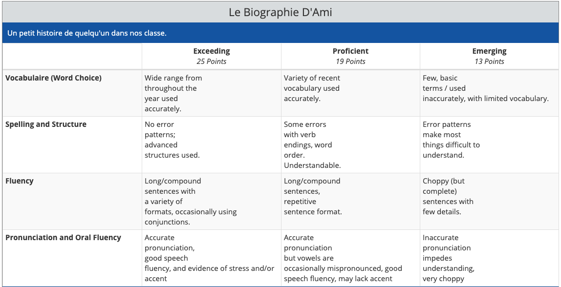
This project matches with provincial outcomes for grade 6 and grade 7 (French as a second language). Students interview each other with questions, and use written and oral language. The completed project will show students’ use and understanding of basic questions and answers; physical descriptions; likes, dislike, and preferences; and simple vocabulary such as parts of the body and colours.

Students will start with a randomly selected partner is class. They will look at exemplars of a biography, talk about it bth as individuals, and as a  class. They will generate a list of interview questions in French, and talk about it in a large group. Finally, each partner will generate their own questions.The quality, and to a lesser degree, quantity of the questions will count on the final assessment.

Final biographies can be submitted in a variety of formats such as a wiki, movie, or essay. All projects are composed in French, using the correct conjugation and vocabulary, which will contribute towards the final assessment.

Processes and Procedures

Stage 1- Team up and brainstorming

Stage 2- Generating framework

Stage 3- Interviewing

Stage 4- Synthesis of Material

Stage 5- Reviewing the product

Team or individual responsibility

As a team, generate the list of information necessary for a biography, and compile a question list. As individuals, generate your supplementary questions, conduct your interviews, complete periodic self and group assessments, and create your final product for grading. Below is a rough timeline for milestone completion dates.

Week 1 Week 2 Week 3 Week 4 Week 5
Step 1/2  Step 3 Step 4 Step 4 Step 5


Sourcing a Piece of Media

*When media is created on the H5P site, the exporting process is inadequate, and provides embedding codes and html links, none of which seem to work here. For the purposes of having this project, I have included a URL linking to the interactive video.

Thumbnail featuring apples that links to an interactive video

Click to activate the video

Media Used: For this project, I took a number of Creative Commons content from both https://www.videvo.net/ and Free Stock Creative Commons videos on Youtube. The accompanying background music was called Jazz in Paris, a royalty-free piece authorized for replay by Media Rights Productions. The videos were pieced together in iMovie, and uploaded to H5P.com, where the video timeline was paired with the multiple-choice queries to create interactive media.

Topic:
French as a Second Language

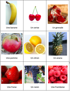
three by three grid of different types of commons fruit, with their names written in French underneath

Learning Outcome:
The learning outcome for this lesson is twofold; first, understanding the masculine and feminine associations of words in French, and second, encountering common fruit names in the French language. The vocabulary used here has previously been brainstormed in class to create a list of the most common fruits, so that any unknown items could be explained in greater detail. A sheet has been attached to review the prior knowledge necessary to successfully complete the activity, or to assist students with unique learning needs. (A note: the singular form ‘un/une’ is included regardless of quantity in the pictures so the students make the oral connection between word gender and language usage).
Upon completion of the lesson, students will be able to: Identify at least 4 of the commonly listed fruits.
Learner instructions
Play the accompanying video. When the video pauses, click the hand icon that appears to answer the multiple-choice question. When the question is answered correctly, the video will continue. There are nine questions in all.

Credits
Music: Jazz In Paris – Media Right Productions https://youtu.be/mNLJMTRvyj8

Outlining a Student Graphics Activity

Here’s an example of a class activity generated to support higher-order thinking skills and summative assessment of the digestive system. The grade level is intermediate elementary, and aligns with the BC science curriculum.

____________________________________________________

Hello, Grade 4s and 5s! We have spent the last term looking at the parts and functions of the digestive system, and now it’s time to show off your knowledge! This will be done by using some of the computing skills we have developed, specifically building PowerPoint slides, and sharing a document through your office365 account.

Your mission: Use PowerPoint to create an equivalent of the human body. Find real machines that perform the same function as the main organs in the digestive system. These can be simple machines (like for last term’s work), or complex ones. For example, instead of teeth, what about a shredder? Create a PowerPoint presentation that ties all the elements together.

The presentation must include a slide for each of the 7 main elements we have already discussed:

  • Teeth
  • Tongue
  • Stomach
  • Liver
  • Large Intestine
  • Small intestine
  • Colon

You can extend your learning by including other parts of the digestive system you have researched on your own. Don’t worry about by-products (things that are produced, but are not organs).

Each organ should have a slide, so there will be at least 8 slides (a title page with your name, and the 7 organ slides). Include a picture both of the organ, and the machine you are comparing it to.

You can either animate your slides to move in their own, or have them advance on a click of the mouse or track pad. If you don’t remember how to advance (or animate) your slides, look in the link section below.

This should be created in PowerPoint, on your office365 account, so that it can be shared with me, and with your classmates. Each person will create a presentation, and you can either type your thoughts onto each slide, or record your voice.  If you don’t remember how to record, look in the link section below.

When you are finished, be sure to ‘share’ your presentation with Mr. M (teacher@sd51.bc.ca). If you’ve forgotten how, I have included a link below. The presentation must be submitted by my birthday, at 3:00 AM.

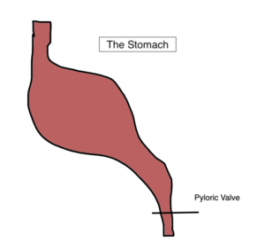
If you want to draw your digestive parts yourself, you can use https://kleki.com/ (but you can use any drawing program you want). It’s a free online drawing program. I drew my stomach easily and then inserted it here. If you can’t recall how to insert pictures into your PowerPoint, there is a link below. If you need help using kleki, there is a link for that as well.


How-To Links

How to share your PowerPoint presentation

Click here to remember how to record your voice.

Click here to re-learn how to animate your slides.

How to insert pictures that you drew or that you downloaded into Powerpoint

How to use www.kleki.com

Creating an Educational Infographic

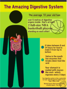
An infographic titled the amazing digestive system.

The digestive system is part of the BC curriculum for grade 6 science. As I am always looking for a great way to engage students, I thought I would approach the big ideas that would allow a child to minimally meet expectations when assessed. While this distillation is by no means a replacement for the curriculum or my teaching, “when you have an opportunity to display information visually, take it” (Balliett, 2011).

When I sketched out my infographic, the visuals came together in a global sense, but seemed a bit disconnected, like random factoids. Dunlap and Lowenthal (2016) provided a schema that I applied to create user engagement, consisting of the situational qualities of immediacy, malleability, compellingness, resonance, and coherence. In tailoring the hook to the target audience, a sense of immediacy is created as most of the learners receiving this are in that 9 to 12-year age range. By “asking learners questions that encourage reflection” (Dunlap & Lowenthal, p. 47) or by giving statements that are immediately relatable, the viewers start interacting on first glance. This malleability relates viewers to the information, as in “I have that”, “I had that”, or “I will have that”. The use of pop-culture graphics (the basketball) and highlighted text is aimed at drawing in those who may not be as interested in science, but are interested in professional sports.

Compellingness is a thread that runs throughout the generated infographic, as the basketball graphic “evokes learners’ interest, attention….and sharing… the unexpected… to make a message memorable and sticky” (Dunlap & Lowenthal, p. 48), as was referencing waterslides, snot, and poop. Even the colloquial use of the words is designed to draw attention, both with their relation to scientific terminology, and with the aspect of cheekiness…all while adhering to the initial learning outcome of functions and structures of the digestive system. This dovetails with resonance, which is in essence the connection made between viewer and product (Dunlap & Lowenthal), which were determining factors in the information points selected for the poster.

Structurally, the principles imparted by Balliett (2011) were employed systematically. The initial colour palette was adjusted as the effort was made to “avoid white as a background” (Balliett, n.p). Though the resulting product was a deviation from the suggested ‘rule of three’, the colours present were non-negotiable as being part of the template available from www.easel.ly. Generally, there are three dominant colours that contribute the bulk of the palette, and that were different enough to not be an issue when viewed by someone impacted by colour deficiencies (as tested by utilizing the NoCoffee vision simulator in a browser window).

An effort was made to generate a ‘hook’ that was both centred, and dominated the reading path; as information moves down the page (the ‘flow’, as noted in Vogelsinger (2014)), it decreases in size, drawing the eye down. The lighter colours were selected, as recommended, as the background (this was by default, but nonetheless the template was employed because of their default position). Finally, the story process of ‘idea to data to conclusion’ (Balliett) was considered, as the information contained on the infographic deliberately mimics the passage of food through the digestive system, from mouth, to stomach, to colon and waste products. The last fact was hidden at the bottom to both tickle the learner’s sense of humour, and so as not to detract from the overall content because of the nature of the information.

References

Balliett, A. (2011, October 14). The do’s and don’ts of infographic design. Retrieved February 15, 2021, from https://www.smashingmagazine.com/2011/10/the-dos-and-donts-of-infographic-design/

Dunlap, J. & Lowenthal P. (2016). Getting graphic about infographics: design lessons learned from popular infographics, Journal of Visual Literacy, 35:1, 42-59, DOI: 10.1080/1051144X.2016.1205832

Vogelsinger, B. (2014, July 16). Inventing infographics: Visual literacy meets written content. Retrieved February 16, 2021, from https://www.edutopia.org/blog/infographics-visual-literacy-written-content-brett-vogelsinger

Designing a Graphic for Multiple Uses

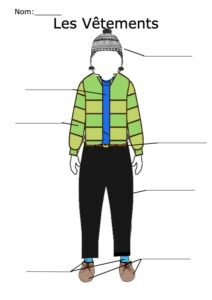
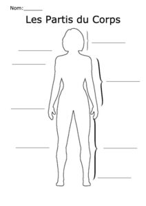
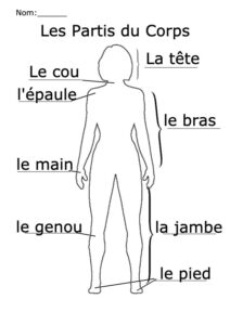
Bonjour! This time, I wanted to create a resource that would allow me to address several aspects of French as a second language, while remaining modular. I searched out a generic person clip art under the creative Commons license, and used www.pixlr.com to create multiple layers. The temptation is to go very deep on this, I limited myself to looking at aspects of clothing, and parts of the body for grades five and six emerging French speakers. I used the layers not only to create the images, but also to create pieces that could be used for assessment. One thing I did notice over Pixlr compared to Sumopaint, is that Sumopaint limits you to only three layers, where as Pixlr is unlimited… Or at least over 30, which is where I got to. This can be expanded to include other parts of clothing, or smaller parts of the body, such as the face, the hands (including wrist, fingers, and thumb), or clothing for summer, for spring, etcetera.

A human outline with some parts of the body labelled in French


Editing a Photo Online

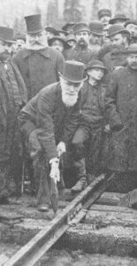
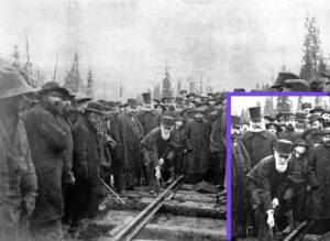
I chose a photo of Donald Smith pounding in the Last Spike at Craigellachie, and cropped it to centre on Smith himself. There are a couple In this 1895 black and white photo, Donald Alexander Smith, surrounded by onlooking workers, bends low to swing the sledge hammer onto a railway spike set in the tie. This spike signalled the completion of a coast-to-coast rail system in Canada.of reasons for this; first, it leads into a class activity of prediction and inference using the modified image; second, because there is so much information contained in the original, that the intended subject of the photo is partially subverted by the periphery. By reducing the extraneous elements, it allows the learner’s focus to be directed to the intended content. I also reduced the contrast of the background to soften the perception of the image so that increasing the brightness does not wash out detail for visually challenged users.

The software I used is www.pixlr.com, a very powerful but free online editing tool. It acts much in the way Adobe’s Photoshop does, allowing for layers and filters, but with no cost. It does have a learning curve, but once some familiarity is established, the range of applications far exceeds many of the online photo editors available. The workflow is moderately simple to those with some experience, and there are multiple tutorials available with a simple Google search to assist the novice user. I was able to crop, create insets, adjust contrast, blend, and exposure levels, enlarge, and edit the picture in a matter of seconds. The software uses its cookies to retain previous projects as well, so it acts as a sort of archive.

Last spike at Craigellachie, with cropped inset showing Donald Smith pounding in the spike.

Used under Creative Commons license.

*Addendum

We are assigned to create a piece of supportive alt-text, and attach it to this blog post. If the cursor is hovered over the close-up of Mr. Smith above,  a pop-up box will appear featuring additional information about the photo for the visually impaired. In the alt-text box should appear the words ,”In this 1895 black and white photo, Donald Alexander Smith, surrounded by onlooking workers, bends low to swing the sledge hammer onto a railway spike set in the tie. This spike signalled the completion of a coast-to-coast rail system in Canada.

Sourcing a Creative Commons Graphic

The transformative rock cycle shows the interrelational changes, from sedimentary to metamorphic, to igneous rock.

The rock cycle is not necessarily a progressive cycle

The graphic I selected today essentially summarizes all of the learning aspect for my unit on rocks and minerals. This is the basic physical geography component covered under the science curriculum from grades five to eight, and the ability to articulate this in some way shape or form is ultimately the learning goal, with levels of sophistication evolving as the learners grow.

This particular info graphic requires only a small bit of modification, as I would change some of the language to be more accessible for younger grades. With that said, I have a tendency to use the correct scientific terms for geological processes, as it allows students to access greater levels of information in information resources outside of the classroom. For example, I would either change the word temperature to heat, or perhaps bracket underneath for my emergent learners. I also would (and have in the past) include small pictures or examples of certain processes that manifest, such as crystallization.

I like this explanatory interpretive graphic (Clark & Lyons, 2010) for its simplicity, for its contrast, and for the fact that you can add examples with a dart of colour to enhance the information therein. The visual and textual information references Gardiner’s multi-intelligences approach (Gardner’s Theory of Multiple Intelligences, 2020), and as “interpretive graphics help learners build understanding of events or processes that are invisible, abstract, or both…Butcher (2006) found better learning from a drawing like this than from a text – only description” (Clark & Lyons, p. 19).

Additionally, I appreciate the fact that this has lots of white space that students can augment or add to around thedeep margins. I have previously had examples of student learning in this manner displayed on this blog.

The rock cycle graphic, located at https://commons.wikimedia.org/wiki/File:Rock_cycle.gif, is used under the Creative Commons license, and comes with additional attached information around modification and distribution. Further, the site explicitly states that direct permission is “not need[ed] to obtain a specific statement of permission from the licensor(s) of the content unless you wish to use the work under different terms than the license states” (“Commons: Reusing content outside Wikimedia”, 2021).

References

Clark, R. C., & Lyons, C. (2010). Graphics for learning : Proven guidelines for planning, designing, and evaluating visuals in training materials. ProQuest Ebook Central

Commons: Reusing content outside Wikimedia (2021, February 14). In Wikipedia. https://commons.wikimedia.org/wiki/Commons:Reusing_content_outside_Wikimedia

Marenus, M. (2020, June 09). Gardner’s theory of multiple intelligences. Retrieved February 14, 2021, from https://www.simplypsychology.org/multiple-intelligences.html#:~:text=To%20broaden%20this%20notion%20of,Interpersonal%2C%20Intrapersonal%2C%20and%20Naturalist.

Examining a Website For Accessibility

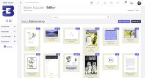
Screenshot with pronatopia filter applied

Bettereducate with pronatopia filter applied.

I often link students and colleagues to content on www.bettereducate.com, as it provides me with free hosting for resources or resource compilations. I installed the ‘NoCoffee’ extension in my Chrome browser, and reviewed the site through the lens of a visually challenged person. With the pronatopia filter on, I noticed that red and grey become more difficult to differentiate between, which rendered some links to almost invisible. Regardless of the visual filters, the grey text on white background barely provides enough contrast for easy visibility. If any aspect of ‘colour-blindness’ is couple with visual issues, the homepage becomes almost unreadable, due to small text and lack of strong contrast or spacing between content. In fact, as with colour deficiency issues, any deviation in visual perception renders the on-screen text inaccessible.

Interestingly, despite resetting the visual impairment menu, the browser extension continued to mess with the display on Chrome, and so I ‘lived’ with the screen flutter for the duration of my examination, until refreshing the page.

A big step towards accessibility for bettereducate.com would be to improve the level of contrast between text and background on the homepage. Light grey text on white becomes practically illegible with even the slightest visual impairment, and is a colour palette that absorbs the red icons integrated into the content throughout the page.

Additionally, the homepage requires some resizing of content, and more spacing so that images or thumbnails are not stacked on top of each other, or bleed together visually. It should be noted that the user section is much better laid out, and less prone to visual interference.

Internal content with colour interference applied

Internal content with colour interference applied

Moose- more than a part of this nutritious breakfast

A thumbnail of cow and two moose calves in the reeds close to the lakeshore

Cow and moose calves feed in the shallows

Moose

The moose (North America) or elk (Eurasia) (Alces alces), is a member of the New World deer subfamily and is the largest and heaviest extant species in the Deer family. Moose are distinguished by the broad, palmate (open-hand shaped) antlers of the males; other members of the deer family have antlers with a dendritic (“twig-like”) configuration. Moose typically inhabit boreal forests and temperate broadleaf and mixed forests of the Northern Hemisphere in temperate to subarctic climates.

The most common moose predators are the gray wolf along with bears and humans. Hunting and other human activities have caused a reduction in the size of the moose’s range over time.

Moose have been reintroduced to some of their former habitats. Currently, most moose are found in Canada, Alaska, New England (with Maine having the most of the lower 48 states), Fennoscandia, Baltic states, and Russia. Their diet consists of both terrestrial and aquatic vegetation.

Unlike most other deer species, moose are solitary animals and do not form herds. Although generally slow-moving and sedentary, moose can become aggressive and move quickly if angered or startled. Their mating season in the autumn features energetic fights between males competing for a female.

Appearance

Hooves

As with all members of the order Artiodactyla (even-toed ungulates), moose feet have two large keratinized hooves corresponding to the third and fourth toe, with two small posterolateral dewclaws (vestigial digits), corresponding to the second and fifth toe. The hoof of the fourth digit is broader than that of the third digit, while the inner hoof of the third digit is longer than that of the fourth digit. This foot configuration may favour striding on soft ground.[85] The moose hoof splays under load, increasing surface area, which limits sinking of the moose’s foot into soft ground or snow, and which increases efficiency when swimming.

The body weight per footprint surface area of the moose foot is intermediate between that of the pronghorn foot, (which have stiff feet lacking dewclaws—optimized for high-speed running) and the caribou foot (which are more rounded with large dewclaws, optimized for walking in deep snow). The moose’s body weight per surface area of footprint is about twice that of the caribou.

Antlers

Bull moose have antlers like other members of the deer family. Cows select mates based on antler size. Bull moose use dominant displays of antlers to discourage competition and will spar or fight rivals. The size and growth rate of antlers is determined by diet and age; symmetry reflects health.

The male’s antlers grow as cylindrical beams projecting on each side of the head at right angles to the midline of the skull, and then fork. The lower prong of this fork may be either simple, or divided into two or three tines, with some flattening. Moose antlers are broad and palmate (flat) with tines (points) along the outer edge. The antlers of mature Alaskan adult bull moose (5 to 12 years old) have a normal maximum spread greater than 200 centimeters (79 in).

By the age of 13, moose antlers decline in size and symmetry. The widest spread recorded was 210 centimeters (83 in) across. (An Alaskan moose also holds the record for the heaviest weight at 36 kilograms (79 lb)).

Population

North America

In Canada there are an estimated 500,000 to 1,000,000 moose, with 150,000 in Newfoundland in 2007 descended from just four that were introduced in the 1900s. In United States there are estimated to be around 300,000, as follows:

  • Alaska’s state Department of Fish and Game estimated 200,000 in 2011
  • in the Northeast a wildlife ecologist estimated 50,000 in New York and New England in 2007, with expansion expected
  • in the Rocky Mountain states Wyoming is said to have the largest share in its 6-state region, and its Fish and Game Commission estimated 7,692 in 2009
  • in the Upper Midwest Michigan estimated 433 (in its Upper Peninsula) in 2011
  • Wisconsin Department of Natural Resources 20–40 (close to its upper-peninsula border with Michigan) in 2003
  • Minnesota 5600 in its northeast in 2010, and under 100 in its northwest in 2009


Europe/Asia

Recorded numbers are sporadic according to regional reporting data.

  • Russia had a population of approximately 600,000 moose in 2007
  • Finland reported a summer population of 115,000 moose in 2009
  • In Norway there were a winter population of around 120,000 moose in 2009
  • Latvia had 21,000 moose in 2015
  • Estonia recorded a population of 13,260
  • Poland had 2,800 moose
  • The Czech Republic recorded 50 animals
  • In Sweden the summer population is estimated to be 300,000–400,000 moose

Human Interactions and Behaviour

Moose are not usually aggressive towards humans but can be provoked or frightened to behave with aggression. In terms of raw numbers, they attack more people than bears and wolves combined, but usually with only minor consequences. In the Americas, moose injure more people than any other wild mammal, and worldwide, only hippopotamuses injure more. When harassed or startled by people or in the presence of a dog, moose may charge. Also, as with bears or any wild animal, moose that have become used to being fed by people may act aggressively when denied food.

During the fall mating season, bull moose may be aggressive toward humans because of the high hormone levels they experience. Cows with young calves are very protective and will attack humans who come too close, especially if they come between mother and calf. Unlike other dangerous animals, moose are not territorial, and do not view humans as food, and will therefore usually not pursue humans if they simply run away.

Diet

The moose is an herbivore and is capable of consuming many types of plant or fruit. The average adult moose needs to consume 9,770 kcal (40.9 MJ) per day to maintain its body weight. Much of a moose’s energy is derived from terrestrial vegetation, mainly consisting of forbs and other non-grasses, and fresh shoots from trees such as willow and birch. These plants are rather low in sodium, and moose generally need to consume a good quantity of aquatic plants. While much lower in energy, aquatic plants provide the moose with its sodium requirements, and as much as half of their diet usually consists of aquatic plant life. In winter, moose are often drawn to roadways, to lick salt that is used as a snow and ice melter. A typical moose, weighing 360 kg (794 lb), can eat up to 32 kg (71 lb) of food per day.

Habitat

Moose require habitat with adequate edible plants (e.g., pond grasses, young trees and shrubs), cover from predators, and protection from extremely hot or cold weather. Moose travel among different habitats with the seasons to address these requirements. Moose are cold-adapted mammals with thickened skin, dense, heat-retaining coat, and a low surface:volume ratio, which provides excellent cold tolerance but poor heat tolerance. Moose survive hot weather by accessing shade or cooling wind, or by immersion in cool water. In hot weather, moose are often found wading or swimming in lakes or ponds. When heat-stressed, moose may fail to adequately forage in summer and may not gain adequate body fat to survive the winter. Also, moose cows may not calve without adequate summer weight gain.

Moose avoid areas with little or no snow as this increases the risk of predation by wolves and avoid areas with deep snow, as this impairs mobility. Thus, moose select habitat on the basis of trade-offs between risk of predation, food availability, and snow depth.

With reintroduction of bison into boreal forest, there was some concern that bison would compete with moose for winter habitat, and thereby worsen the population decline of moose. However, this does not appear to be a problem. Moose prefer sub-alpine shrublands in early winter, while bison prefer wet sedge valley meadowlands in early-winter. In late-winter, moose prefer river valleys with deciduous forest cover or alpine terrain above the tree line, while bison preferred wet sedge meadowlands or sunny southern grassy slopes.

Known Predators

A full-grown moose has few enemies except Siberian tigers (Panthera tigris altaica) which regularly prey on adult moose, but a pack of gray wolves (Canis lupus) can still pose a threat, especially to females with calves. Brown bears (Ursus arctos) are also known to prey on moose of various sizes, including many pregnant adult cows in some parts of Alaska and Scandinavia and even the rare bull moose, and are the only predator besides the wolf to attack moose both in Eurasia and North America.

However, brown bears are more likely to take over a wolf kill or to take young moose than to hunt adult moose on their own. American black bears (Ursus americanus) and cougars (Puma concolor) can be significant predators of moose calves in May and June and can, in rare instances, prey on adults (mainly cows rather than the larger bulls). Wolverine (Gulo gulo) are most likely to eat moose as carrion but have killed moose, including adults, when the large ungulates are weakened by harsh winter conditions.

Orcas (Orcinus orca, also known as killer whales) are the moose’s only known marine predator as they have been known to prey on moose swimming between islands out of North America’s Northwest Coast, however, there is at least one recorded instance of a moose preyed upon by a Greenland shark.


[Please note that formatting does not translate to this blog, and so a PDF version is available here.]

*Edit- Tumbnail added 02/14/2021. Thumbnail created using http://makethumbnails.com/ 
Powered by WordPress & Theme by Anders Norén